Appearance
Theme Settings
Bold offers a wide range of configuration settings so that you can customize your publication in many ways and get the most out of it.
Site Wide Settings
These global settings are designed to manage and customize the overall aspects of your site experience.
You can find all the site wide settings in Settings --> Design & branding --> Site wide
Fonts
Bold includes three different fonts that you can use to customize the appearance of your publication and give it a unique look that sets it apart from the rest. Bellow, you can see the list of available fonts:
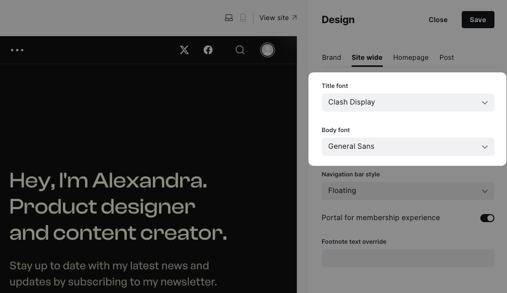
- Clash Display
- General Sans
- Literata
You can choose the font you want for both the titles and the rest of the content displayed on all pages of the site. All fonts are available in both settings, regardless of whether they are serif fonts or sans serif fonts, providing multiple possible combinations.
By default, Bold uses the Clash Display font for titles and the General Sans font for the rest of the content. If you want to change the font for titles, you can do so in the Title font setting, and if you want to change the font for the rest of the content, you can do so in the Body font setting, as shown in the following screenshot:
INFO
The font files are included in the theme locally, so they will be hosted on your server without the need to load them from external services such as Google Fonts, ensuring that your site complies with the General Data Protection Regulation.
Custom Fonts
As of version 1.3.0 of the theme, support for custom fonts has been added, this means that it is now possible to replace the default fonts of the theme with the fonts that Ghost offers natively. This allows publishers to have more control over their branding and have a wider range of options to customize their publication.
This new option can be found in the design Brand settings as shown below:
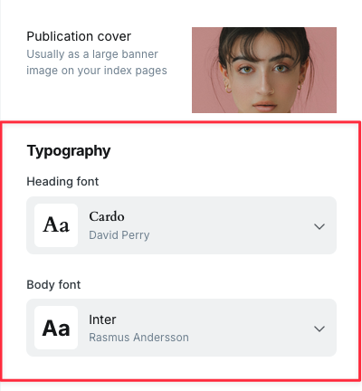
If you want to return to the default fonts, simply select the Theme default option in the corresponding field.
INFO
This option is only available if you're using Ghost 5.101.0 or later and Bold 1.3.0 or later.
Navigation Bar Style
Bold offers three different styles or modes for the navigation bar that appears at the top of the page: Floating, Normal, and Sticky.
Floating
This mode will hide the navigation bar when you scroll down and show it again when you scroll up using a nice animation.
Normal
This is the default mode, typically present on most pages, where the navigation bar is visible while you are at the top of the page and becomes invisible once it's outside the viewport. To see it again, you need to scroll back to the top of the page.
Sticky
This mode will keep the navigation bar always visible, regardless of where you are on the page or which direction you scroll.

Portal for Membership Experience
If you want to use Portal for all Members functionalities instead of the ones provided by the theme you can enable the Portal for membership experience setting as shown in the following screenshot:

By enabling this option all links and buttons for sign up, sign in, newsletter, account and other membership-related features will use the Portal interface instead of linking to the custom pages that the theme provides.
Footnote Text Override
By default, the theme will display a footnote in the footer that includes the copyright symbol, the current year, the title of the publication, and credits to the Ghost platform, for example, "Bold Theme © 2024. Powered by Ghost".
If you wish to replace that text with your own, you can do so in the Footnote text override setting, as shown in the following screenshot:

If for some reason you wish to restore the default text, just clear the text you have entered in the corresponding field.
Posts Per Page
By default, Bold displays up to 10 entries per page. If you wish to modify this number, please follow these steps:
Create a backup of the theme file (
bold.zip)Unzip the theme file
Open the file
package.jsonwith a code editorLook for the next line of code and change its value as you prefer
json
"posts_per_page": 12, // Default is 10Save your changes
Zip the theme and upload it again
Homepage Settings
These settings will help you customize the appearance of the homepage, particularly the initial section (also known as hero section).
You can find all the site wide settings in Settings --> Design & branding --> Homepage
Hero Layout
Bold offers four different layouts that you can use to customize the appearance of the hero section so that your publication stands out from the rest: Split in half, Large background, Side by side and Typographic.
Split in half
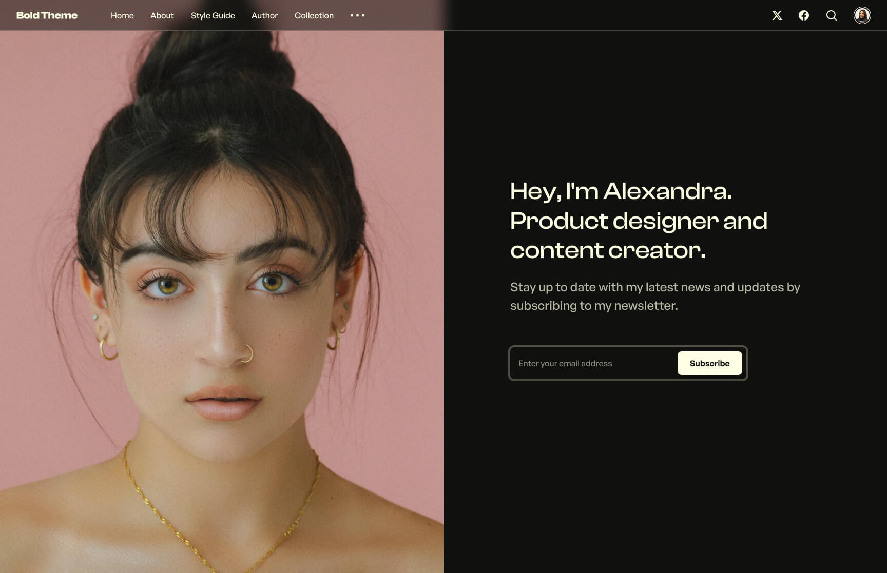
In this layout, the publication cover is displayed on one half of the screen, while the other half shows the title, the publication's tagline, and the call to action. This is the default layout.
Large background
In this layout, the publication cover is displayed in fullscreen, while the title, the publication's tagline, and the call to action are shown on top of it.

Side by side
This layout is similar to the first one; however, the order is inverted, and the publication cover is smaller with slightly rounded corners.

Typographic and center aligned
This is a slightly more conservative layout in which the content of the section is centered. The publication cover is displayed in a smaller circular form, and the font size of the title is larger.

You can select the layout you desire to use in the setting Header section layout, as shown in the following screenshot:

INFO
In all cases, if you do not provide an image as publication cover, the theme will provide a fallback design for the selected layout.
Hero Colors
With Bold, you have the option to choose the colors that will be used in the hero section for both the background and text, as well as other interface elements. This allows you to further customize the appearance of the homepage of your publication.
To change the background color, you just have to choose the desired color in the Header background color setting. To change the text color and other elements, simply select the desired color in the setting Header foreground color, as shown in the following screenshot:

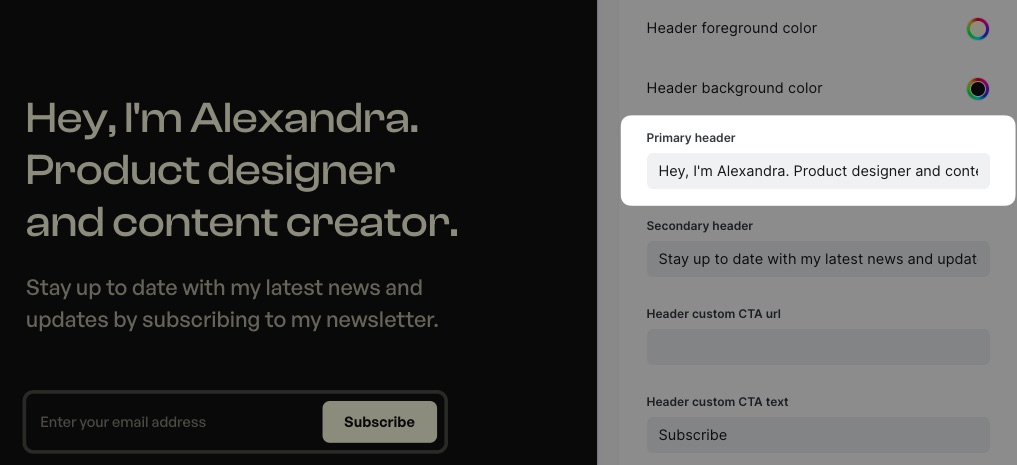
Primary Header
By default, the theme will use the title of the publication as the title of the hero section. If you want to display a custom text instead, you can set it in the Primary header setting, as shown in the following screenshot:
If you want to revert the change and display the publication title, you can simply clear the text field.
Secondary Header
By default, the theme will use the description of the publication as the description text of the hero section (aka tagline). If you want to display a custom text instead, you can set it in the Secondary header setting, as shown in the following screenshot:

If you want to revert the change and display the publication description, you can simply clear the text field.
Custom Call to Action
In the hero section, a subscription form will also be displayed by default to subscribe to the publication. Alternatively, if the Portal for membership experience setting is enabled, a button will be shown in its place, opening the Portal subscription interface. The form and the button are visible to users who are not yet subscribers. Once they register and log in, the form and the button become unavailable for such users.
If you want to use a call to action that is always visible regardless of whether the user is logged in or not, you can do so in the theme settings. Simply enter the desired URL in the Header custom CTA url setting field and enter the label you want to display in the Header custom CTA text setting field, which by default has the label Subscribe.

If you want to remove the custom call to action and revert to the default behavior, simply clear the field in the Header custom CTA url setting.
Post Card Design
If you want to highlight the posts displayed on the homepage of your publication, perhaps because you intend to use it as a portfolio, you can use the Showcase design offered by the theme, which looks as shown in the following screenshot:

To use the alternative design, you just have to select it in the setting Post card design, as shown below:

INFO
Take into account that this design is only available on the homepage, so on subsequent pages, the original design will continue to be displayed.
Post Settings
These settings only affect the appearance and behavior of posts and pages.
You can find all the site wide settings in Settings --> Design & branding --> Post
Post Header Layout
Bold offers three different layouts in which the header of a post or page can be displayed: Split in half, Stacked, and Large background.
Split in half
This is the default layout in which one half of the screen displays the title and additional information of the post, while the other half shows the featured image.
Stacked
This is a slightly more conservative layout in which the featured image is displayed just below the title and meta information of the post.
Large background
This is a visually appealing layout in which the post header occupies the entire viewport. In this case, the featured image is displayed in fullscreen, while the title and other post information are shown on top of it.
You can select the layout you desire to use in the setting Post header section layout, as shown in the following screenshot:

It's important to note that the selected layout will be used for all posts and pages in your publication. However, it's also possible to choose a different layout individually for a specific post or page. To do this, you can simply select the desired layout in the page settings under the Template setting, as shown below:
